Friday, December 23, 2005

When do these coincidences happen?

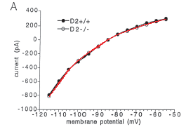
How is it possible for the same data curves to appear in two different papers about two different species, as it happened in the 1997 studies and in the 1999-2000 studies?

One possibility is that there is a mistake. Someone is not too careful with their figures, they mix them up when they submit them to the journals.

Another possibility is scientific fraud. In fact, fraud is often discovered because of these simple incongruences. For example, consider the famous case of Jan Hendrik Schoen, the Physicist at Bell Labs who had a knack for reusing the same graph in two or three papers, and for extrapolating "measurements" well beyond the region where they were constrained by data.

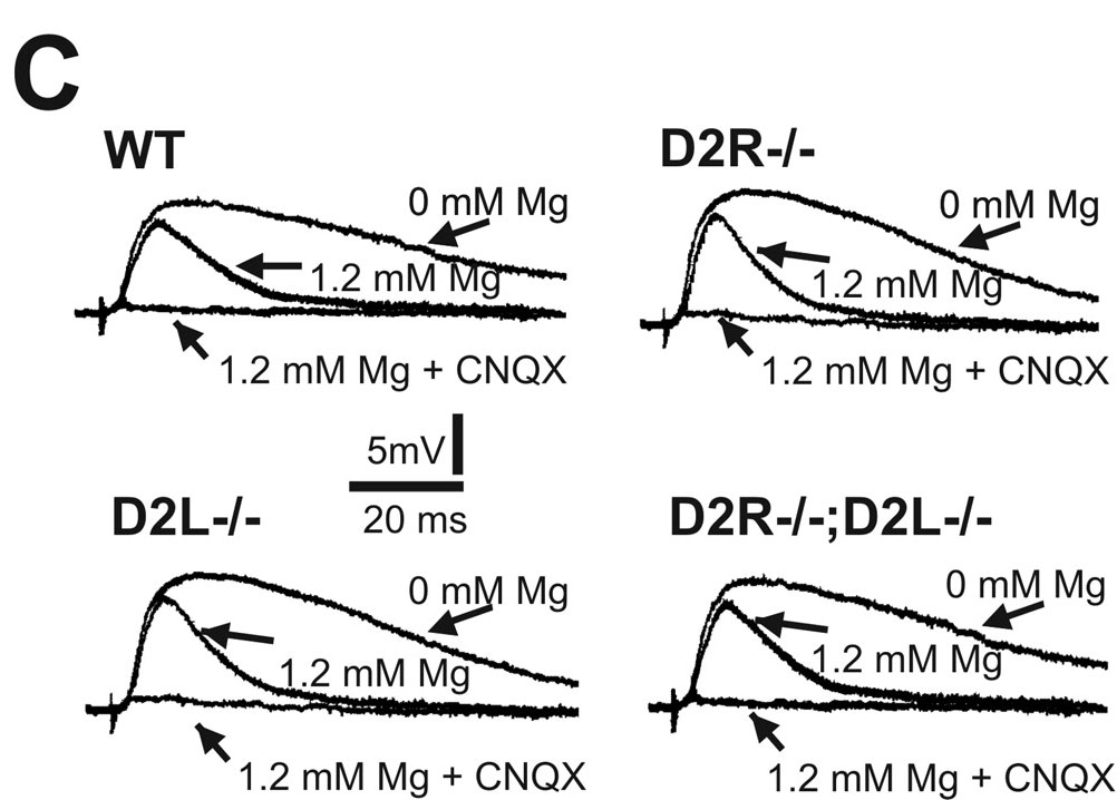
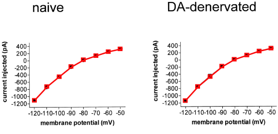
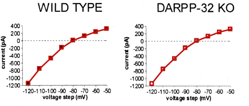
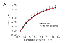
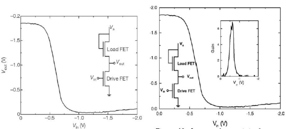
Below is a famous pair of images from Schoen's opus. The left one appeared in Nature, the right one appeared in Science. The curves are supposed to report on different results, and yet they are identical down to the noise fluctuations.
The discovery of fraud in Schoen's work led to the withdrawal of a number of papers, including 8 published in Science and 7 published in Nature.

Does this explanation apply to the studies discussed earlier in this blog? Who is in charge of establishing whether there is fraud or not? This will be the topic of a future post.

Friday, December 16, 2005

A puzzle for the reader

Here is a puzzle for the reader.

Consider this 2004 study by the same group as the previous posts: "Chronic haloperidol promotes corticostriatal long-term potentiation by targeting dopamine D2L receptors.", Journal of Neuroscience, 2004, 24: 8214-8222.

This study was corrected few months later in an Erratum (Journal of Neuroscience, 2005. 25: 1034-1035). The Erratum replaces five of the paper's six figures (only Figure 1 is spared). According to the Erratum, the figures needed to be replaced because of "incorrect control data points [...] corresponding to pretetanus values of the LTP experiments."

This might be an incomplete explanation for the replacement of the figures. Indeed, looking back at the original Figure 3C (which appears below), can the reader spot a remarkable coincidence? Notice that these traces are not "control data points".

More mice, more rats

In the previous post, we saw a case in which the same data curve appears in two studies, one conducted on rats and one conducted on mice. Here is an even more peculiar coincidence, again involving a pair of studies performed by the same group. Again, though these studies were performed in different species, they yielded undistinguishable data.

Consider this 1999 study performed in rats: "Unilateral dopamine denervation blocks corticostriatal LTP." Journal of Neurophysiology, 1999. 82: 3575-3579.


Here is Figure 1B of that study. The legend says that the curve on the left was measured in naive rats, and the the curve on the right was measured in denervated rats. The colored curves were added by hand to overlap the data points.

Now consider a 2000 study by the same group, this one performed in mice: "Dopamine and cAMP-regulated phosphoprotein 32 kDa controls both striatal long-term depression and long-term potentiation, opposing forms of synaptic plasticity", Journal of Neuroscience, 2000. 20: 8443-8451.


Here is Figure 3B of this study. The legend says that the curve on the left was measured in wild-type mice, whereas the curve on the right was measured in knock-out mice. The colored curves were added to this plot. What is truly remarkable is that they are the same as in the rat study.

It is indeed a peculiar coincidence that the naive rats yielded the same curve as the wild-type mice, and the denervated rats yielded the same curve as the knock-out mice.

Thursday, December 15, 2005

Mice and rats

Here is a curious case in which one data curve appears in two papers (one on rats, the other on mice). This would seem to be a remarkable coincidence.

Consider this 1997 study performed in rats: "Endogenous Adenosine Mediates the Presynaptic Inhibition Induced by Aglycemia at Corticostriatal Synapses", Journal of Neuroscience, 17: 4509 - 4516.


Here is Figure 1A of this study. The colored curve was added by hand to overlap with the black data points.


The same curve reappears in Figure 3B. Indeed, the colored curve is the same as in the previous figure (scaled rigidly). It passes through all the black data points. This similarity would be easily explained if the control data were the same for the two figures.

Now consider another 1997 study by the same group, this one performed in mice: "Abnormal Synaptic Plasticity in the Striatum of Mice Lacking Dopamine D2 Receptors", Journal of Neuroscience, 1997; 17: 4536 - 4544.


Here is Figure 1A of this second study. The red curve was added to the figure: it is the same as the one in the two figures of the previous paper (again, scaled rigidly). The curve overlaps the white data points , which are the ones for the genetically modified mice.

It seems to be a remarkable coincidence that the genetic modification made mice yield the same curve as wild-type rats.